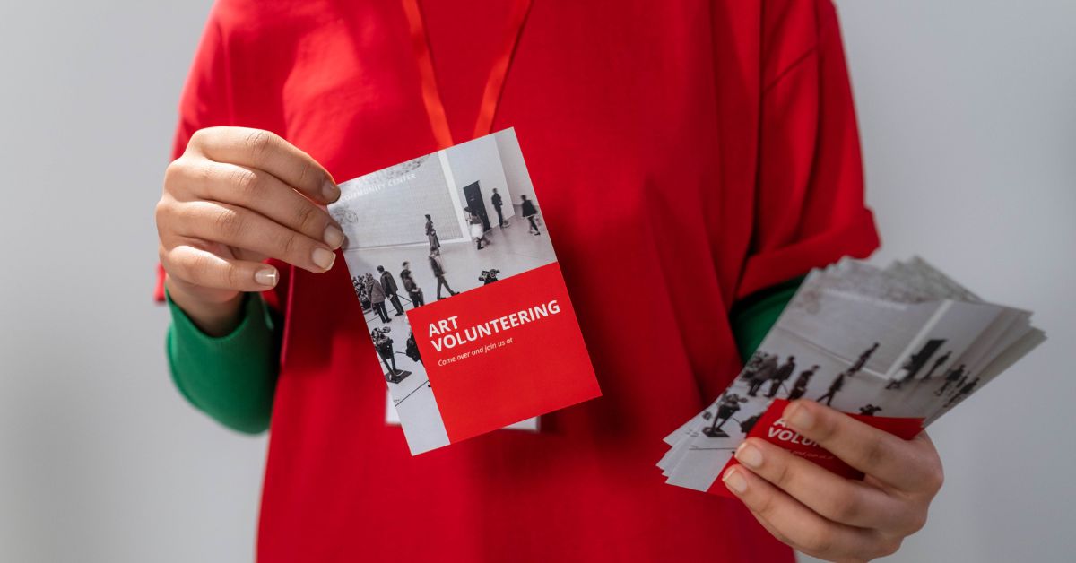
A good flyer will make a passerby stop and consider your business or cause an online store visitor to become a paying customer. Quality physical and digital flyers can provide a lot of marketing value to your enterprise no matter its industry.
That is, provided you make flyers with the right elements! You don’t need a graphic design degree to make excellent, eye-catching flyers, but you do need to keep a few things in mind if you use a free flyer maker online.
Table of Contents
Start with a “Focus Point”
First and foremost, any flyers you create need to have a clear focus point. The focus point is essentially the image or piece of text that your audience should look at first due to its design, size, or some other element.
Your focus point should probably be at the top or center of your flyer. Make sure it’s important and relevant to the rest of the flyer’s elements – for example, a “REGISTER NOW” section at the top of the flyer could serve as the focus point, helping the audience to read the rest of the flyer beneath it by directing their eyes downward.
Include All Key Information
Any flyer you make, regardless of industry or goal, needs to have key information. For instance, if the flyer is an advertisement and is meant to bring people to your online store, that flyer needs to include information like:
- Your web domain or web address
- The name of your company
Meanwhile, if you want to make a flyer for your small business’s grand opening, be sure to include:
- The address of your business storefront
- Your operating hours
- The date when your business opens for business
- And more
Stick to the Same Font for All Text
Putting all that information in text on your flyer doesn’t have to be tricky, especially if you use the exact same font for every bit of text. You should not use multiple fonts for your flyer at all, even if you want to grab the attention of a viewer.
Multiple fonts look clunky and clumsy and make your flyer appear to be less professional or less attractive. Find a font that works for all the text on your flyer’s design and stick with it, even for large call to action text or minor details printed at the bottom of the flyer’s space.
Keep the Text Minimal
That all said, you should try not to inundate your flyer with too much text. Stick to the bare minimum if at all possible. For example, if you are opening a new restaurant and want to put up flyers around town to announce this, don’t include a full menu of all the food and beverages you offer. Instead, include a few key items to pique the interest of potential diners.
Choose the Right Colors
A good flyer should have excellent colors that work well with your brand or company. If your company already has some brand colors, use them for your flyer. Otherwise, choose complementary shades, such as multiple shades of blue, red and green, and so on.
If needed, experiment with multiple color palettes to make sure that your poster looks engaging and attractive, not “loud” or annoying.
Keep it Simple
While the above tips are important, you also have to remember the golden rule when it comes to making flyers: keep it simple no matter what. Complex, crowded, or overly busy flyers will overwhelm viewers and cause them to turn away.
Instead, you should try to trim the fat and only include the elements or text that are absolutely necessary for the flyer to work. This is easier said than done, but free customizable flyer templates from PosterMyWall can help you get on the right track.
Choose the ideal template that has enough space for important text and information about your business or an upcoming event. Then tweak the template here and there so you can make sure it has enough space to fit all the other elements you have planned.
Don’t Forget the Call to Action!
Last but not least, make sure every flyer has a call to action at the bottom. The call to action should inspire a viewer or potential customer to do something, like place an order, visit your website, or visit your retail storefront. The call to action should include any relevant details needed to complete the intended action, like a phone number or web address.
As you can see, putting together a compelling and engaging flyer with a free flyer maker online is easier than you think. Remember to keep your design simple, include key information, and think about how your flyer will look in the eyes of your customers.


